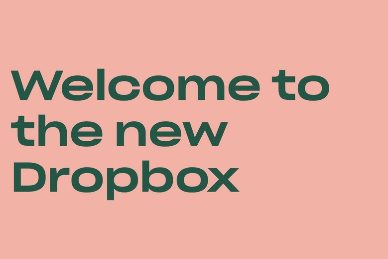


This week Dropbox announced a redesign to its platform! The new design introduces a lot more colour in contrast to its previous white-and-blue look. It also includes a flatter box logo that makes it look less like an actual box and more like planes of surface... an even more abstract box, essentially.
This is the company's first major revamp in the last 10 years, and it presents a sharp contrast to some of its biggest file-sharing competitors like Box, Google Drive and iCloud – all of which have some version of blue in their logos.
The update in Dropbox's makes it look like the cool kid of file sharing with its new, squashed-up typeface called Sharp Grotesk to accompany it.
Dropbox said in an interview with AdWeek that it hopes the new colour combinations will help it stand out a bit more, and aims to give a "nod to the creativity of our users." Now, the look and feel of Dropbox is more similar to Adobe than to, for example, Microsoft OneDrive.
Dropbox says the logo colours "can change based on the situation" – even if we're not entirely sure on exactly what situation we could be in that would require our file sharing service to be mint green rather than crimson red.
Even with the new logo and design, most of the web and app UI remains visually similar – mostly white with blue and grey accents. The new colour combinations are more likely to be noticed on marketing campaigns and ads than on interface changes.
The company added in the AdWeek interview that it will be rolling out more ad campaigns "strategically placed in cities and neighbourhoods where creative people tend to live and work" – so we can expect more funky hues from Dropbox in the nearest city of hipsters, essentially.
Regardless – we think the new design looks pretty cool!
What do you think?